
Whilst I liked the logos created for the companies, I didn’t want the box art just to be a composition of all the logos. Instead I wanted something which represented the game’s theme of offering a choice. I also wanted something bold, crisp and abstract.
I posted the job up on conceptart.org. I was reassured by the number of other games companies posting for freelance art requirements there, and I wanted to make sure I was offering a fair wage for the art I wanted. It was an incredibly easy process, and I had plenty of applicants. In the end I went with George Adams, for one thing he’s in the country, making communication much more convenient, and I loved the style of art on his portfolio.
Looking back over the work he did for me- drafts, retouches, colour palletes etc- it’s easily been one of the best outlays of money in this whole project. I’ve collected some, but not all, of the prototype box art imagery to show how it developed. Along the way I explained the theme of embezzling money from companies, but you can see how a representation of giving a choice became central.
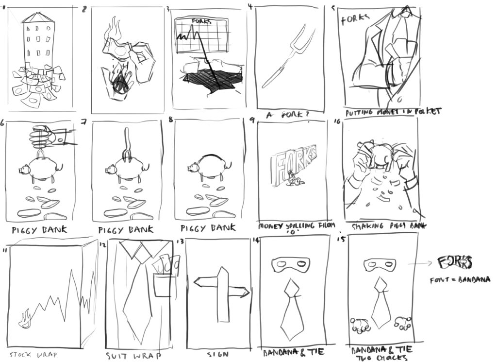
Initial draft ideas 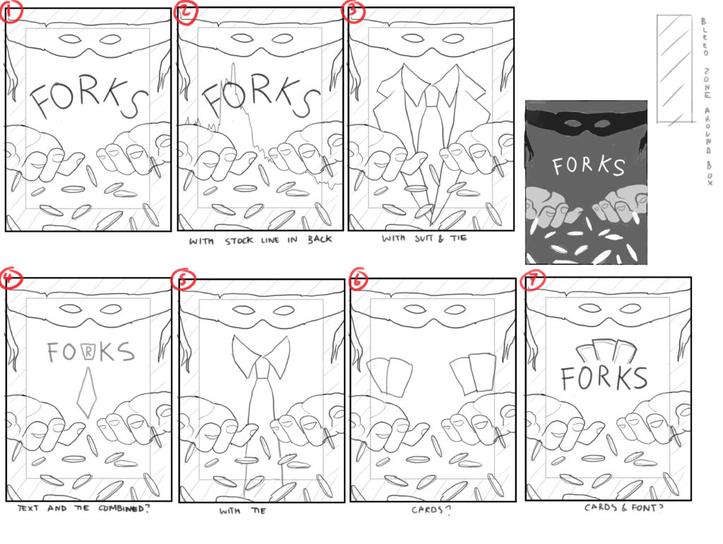
Beginning to focus on the hands offering a choice 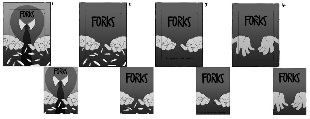
Just the hands 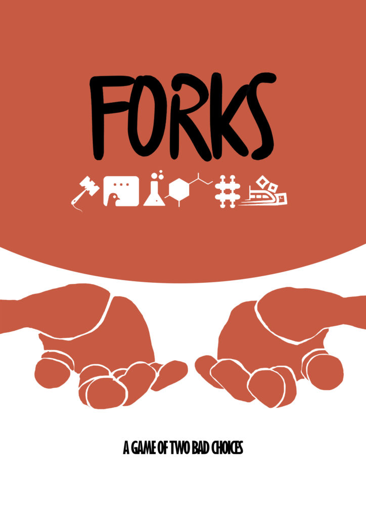
Quite close to the final image 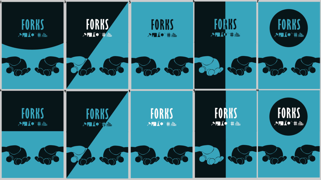
Beginning to test with twotone colours 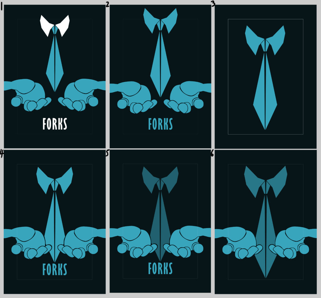
settling on tie (sword like) with hands 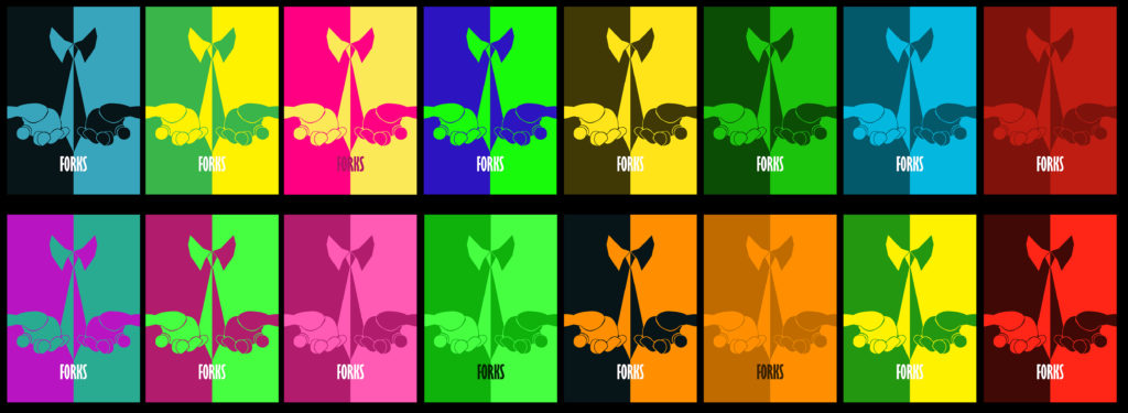
More tone tone colours- went away from them for legibility reasons 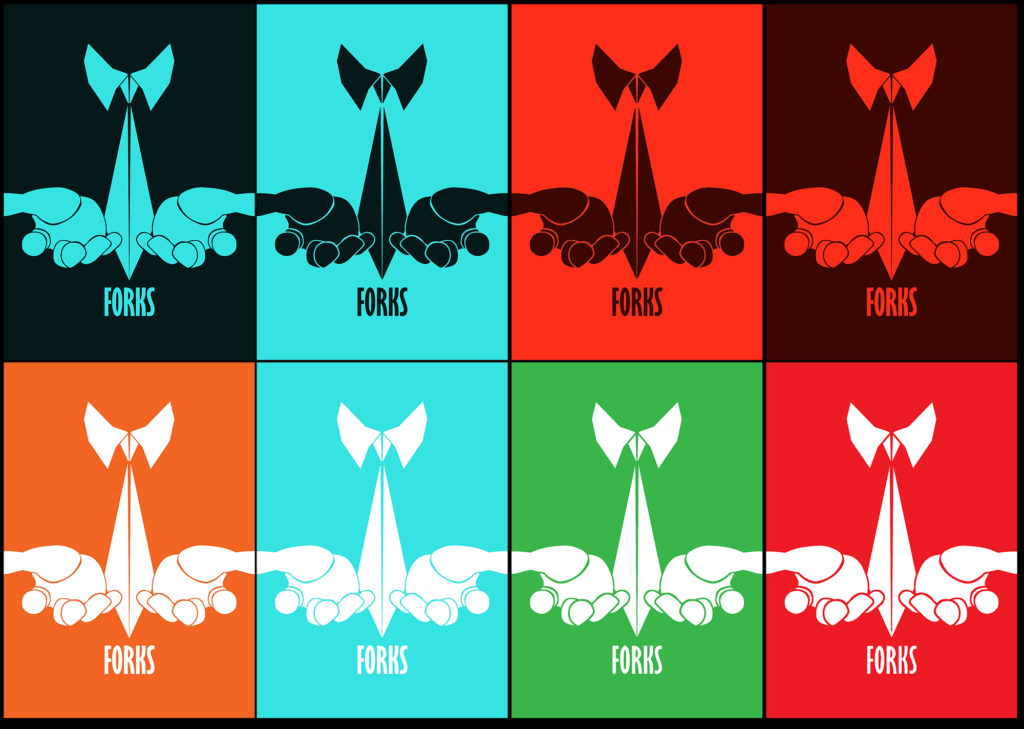
Colour palette test
In current news we are less than a week away from our Kickstarter launching! Make sure you check back next Tuesday to not miss the early bird, or sign up to our newsletter!